The Paints of Today are changing at a rapid rate. so many older colors are discontinuned, It’s important to find the ones you like for your pallette , and test them in several ways ; as in alone , firing temperature, blending with other colors etc.
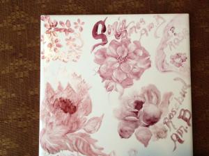
One way I like to do test pieces is make a pretty test piece, instead of just boring squares. ( Like I did with my ” Taking on Mixing Yellow thread” ) so many of the reds on the market are very similar but certain artisist will buy in bulk and sell under their name , So you may have 4 of the same reds, all with different names. ( as I was told by Stephen Hayes at a seminar. )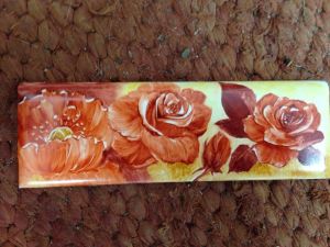 tile fired to 015
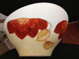
this vase has a few layers of my favorite reds. NO Cad reds were used
Most will break sown into light or yellow reds, Medium reds , and darker value reds. then all the various mixes with purples and blues and dark greens added to get various shades or Red grape and such. but BEWARE of those CADMIUM Reds. as they are not always labeled as a cad color and also run into the Bright oranges .
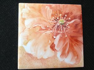
Cad paints do not play well with other colors, ( see here over pink flower and golden yellow BG ) and they are usually
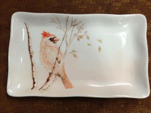
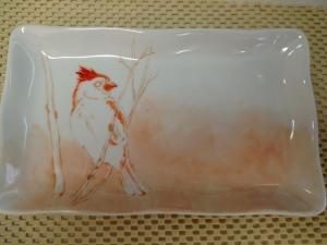
SHOWING AFTER FIRE ALL ORANGE BURNDT OFF
Before -Bright Orange
After fire
Very bright even in their powder form. 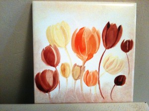 the thing with cads is they like to be thick , if fluffed and softened they burn off. or turn brown . do not fire over 017 -018/
-
Before
you can see at top all the shaded area in orange below is pretty much gone. Now cads will fire nice only when you ONLY use that color, you cannot mix with other colors especially non cad colors. I choose to just NOT use them. IF you do want bright colors , HELD of Harrogate UK has a whole set of cadmium colors including yellow and red that are mixable on their site.
NOW onto our regular reds, most are iron based, then dark pinks and Rubys which are gold based. when testing I find it useful to also blend paints, both wet on the brush and also mixing dry paints together for custom mixes.
That is best once you know your colors. One thing I have noticed. when painting next to wet wet colors, the golden ochers , Yellow browns, mustardy yellows are much more trustworthy when painting next to or blending with most reds.
 so some
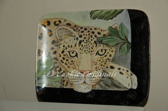
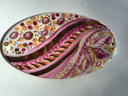
of my favorite colors : Maryland china Yellow red, also Josephine and Dallas and Ashcroft YRs, similar are Jos. Meissen red, Rich rust -Held , Fay Good Meissen red, San Do Orange Red and Persian red and Rynne yellow red( which is a more red red to me ) see free style red poppy tray bottom right. . Most Blood reds and Fay Goods Banskia red and Pompadour are darker. also Kay Knapp’s Apricot orange , and Celie Evens Orange peel are nice strong reds , and Paula Whites colors are a very good set for mixable colors that also fire pretty hot. I usually fire 016 , but most of my colors will fire at 015 for first fire. ~~*NOTE – when I fire I always VENT my kiln an inch for first 2 hours, and a half inch for rest. **
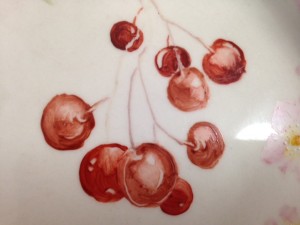
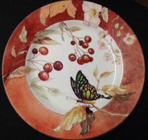
Cherries make good subjects for testing and blending your reds. feel free to use this study and keep track of the colors of reds you use. on one tile paint each cherry a Different red, on another blend light med and dark colors for shading in your cherries. **Note ; If painting on glazed ceramic tiles for testing , remember the ceramic holds more heat so its like firing one temp hotter. I have still fired tiles at 015 but keep this in mind as well as the different glazes that can make some difference in color changes.

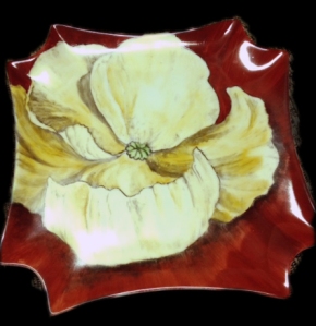
Free Style Poppy tray Rynne Yellow red fired 015
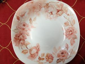
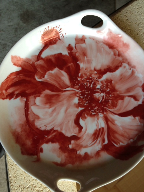
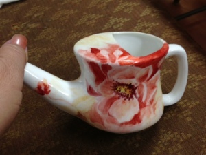
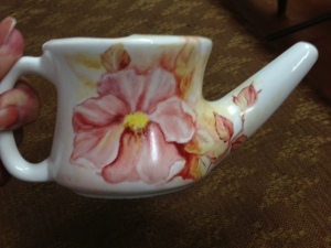
Persian red and blood red, softened and blended.
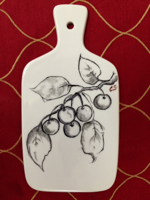
BW cherries study
Happy Painting 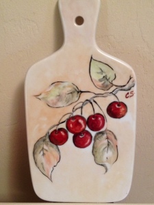
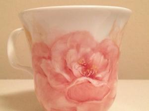
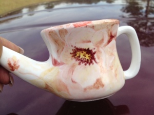
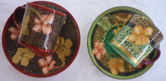
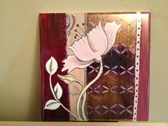
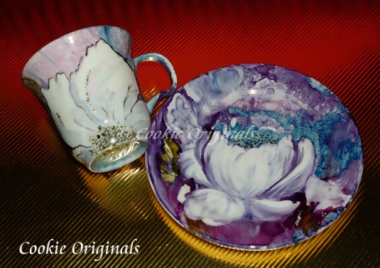
the top cup is soft blended Persian red, with Josephine gold leaves .
the tile above right are the golden reds; rubies american beauty ( many of those are also very similar depending on brand names.
Here are a few more samples of Similar reds. Fired at 016 Banskia ( darkest) BloodRed- old vial – Orange peel, Rich rust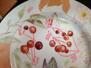
 final
final
this piece shows 4 more reds, each leaf a different one but all pretty similar, except the banska with is a cooler darker red. Can you tell the differences? this is second painting of depth. over same color , Before 2nd fire. ( first fire 015)Banskia, PW South Brown(name is misleading its a yellowred to me ) , KKnapp-Orange Peel , SanDO -orange Red- Josephine -Meissen Red,
Please leave me a comment On anything you find interestingor have questions , Was this post helpful to you ?.


 so some


